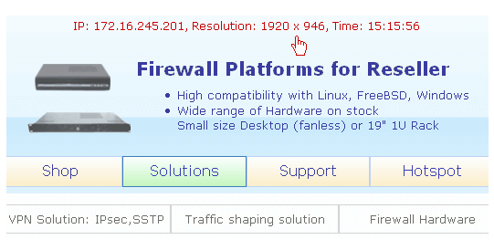
PHP and Javascript for resolution, IP, time
This script shows the resolution of Browser in smartphone, tablet or PC window that you can use for your homepage.
Author: bha created on 2017-12-22

Image: Sylbek 2017
Smartphone friendly website
During the the homepage adaptation for mobile it was always necessary to have the screen width in view. Therefore, the corresponding line for the width and height has been inserted in Javascript, see below.Explanation: Textarea can be often enlarged (bottom right corner), mark the content with CTRL+A and copy to the clipboard with CTRL+C.
Then it was necessary that the values change automatically when window is changed or smartphone/tablet is rotated. To measure the page width, every second was the idea. Why not have the time with it in view?
Finally, I found this feature useful and I have also switched online (see Sylbek bottom right). If you find it useful, you can also integrate it into your website. Below is the guide.
Javascript (showinfo.js) includes:
Time function, resource saving version
The time is from the web server, not the local device. This time is read with every click via PHP (page load). Then only seconds are counted via Javascript function until the next click. This is resource-saving variant.The related PHP page (showinfo.php) contains:
If you load these two files on your PHP server you will see a result.
Below you can see the compact version, everything in one file:
Contact and Support
☏ +49 721 66980 610
Write to us,
you can expect an answer on the same or next working day.
you can expect an answer on the same or next working day.
Get together and talk
We would be happy if you pick a time (right here) and arrange a free online meeting with us via Microsoft Teams. For example, we could talk about whether you can optimise your M365 licenses and reduce costs.
Customer support
We are here to help you with any questions you may have about Microsoft 365 and Azure. You can count on our support at fair prices in the range of 75-95 EUR per hour. We can use your ticket system or our support Jira ServiceDesk, see sample ticket.
You will be supported by security experts who continuously update their Microsoft skills and prove them with manufacturer certificates. This is a MUST for us to keep customer support at the highest level and up to date with the latest technology.
 Copyright 2003 - 2026 Sylbek Cloud Support
Your IP 216.73.216.110, your resolution , our time 19:59:56


